FFBD & EFFBD Diagram Project Preferences 

The Function Flow Block Diagram (FFBD) and Enhanced Function Flow Block Diagram (EFFBD) diagram project preferences enable you to determine how FFBDs and EFFBDs are displayed by default (options controlling what is displayed and how). Individual FFBDs and EFFBDs can then be customized, as desired.
Options set in the Project Preferences dialog establish the defaults for all future diagrams. Any diagrams which are open or diagrams for which the stored views have been saved will not be affected by changes to the Project Preferences. To change these diagrams, open the individual diagram and change the local options.
|
NOTE: |
The fundamental structure of FFBDs and EFFBDs is the same. EFFBDs then layer the display of item and resource flow on top of the fundamental functional structure. For that reason, the diagram types share a common set of preferences. FFBDs simply ignore those settings which are not relevant for their display. |
Options set in the Project Preferences dialog establish the defaults for all future diagrams. Any diagrams which are open or diagrams for which there is a stored view will not be affected by changes to the Project Preferences. To change individual diagram views, from the open diagram, with nothing selected from the Toolbox select the Properties tab. This will allow changes to the individual diagram and change only the local options.
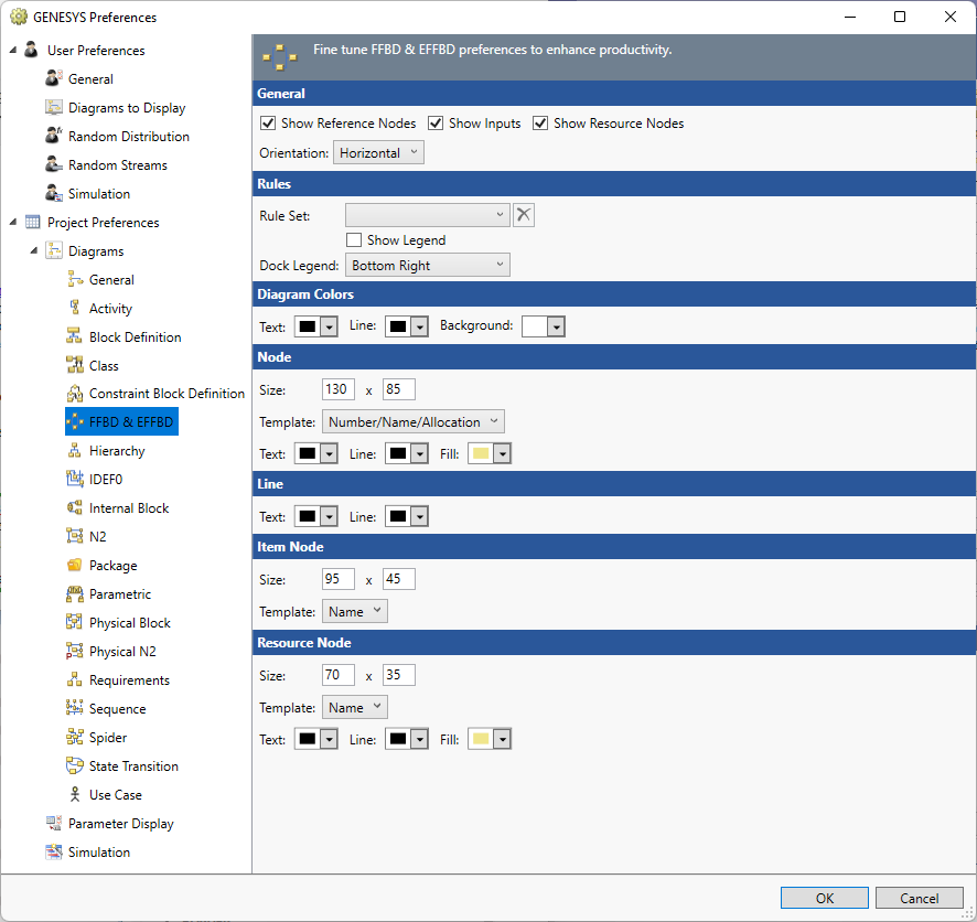
General
Show Reference Nodes - controls whether reference nodes should be computed and shown at the beginning and end of the flow. Reference nodes indicate the source and sink of the control flow (what function completed immediately before this flow begins and what function will be enabled when this flow completes).
Show Inputs - controls whether inputs will be shown by default. In cases where there is a large amount of inputs, it can be helpful to hide inputs to focus attention on triggering data.
Show Resource Nodes - controls whether resource nodes will be shown by default. Resource nodes reflect the production, consumption, and capturing of required resources during function execution. This option is not used by FFBDs.
Orientation - controls if the main flow of the diagram is top to bottom (vertical) or left to right (horizontal).
Rule Set
The Rule Set that should be applied on opening a new diagram.
Show Legend - controls if a legend that explains the rule sets appears on the diagram.
Dock Legend - controls the location where the legend appears on the diagram: bottom left, bottom right, floating, top left, and top right.
Diagram Colors
The order of precedence GENESYS uses when deciding which color to use on a specific node on a diagram is as follows. If a color setting is nil/automatic, GENESYS will continue to move down the list until it identifies the color to be used:
- Colors applied directly to the specific node on the specific diagram (set using the Toolbox Properties settings on the diagram)
- Colors specified for the entity in the Rule Set selected.
- Colors specified for the entity text, line, and fill attributes (set on the Properties tab of the entity property sheet)
- Colors specified for the entity class text, line, and fill properties (set on the class property sheet)
- Node colors specified for the diagram type (set in the Project Preferences)
Text - controls the color of the text on the diagram.
Line - controls the color of the lines on the diagram.
Background - controls the color of the background on the diagram.
Node
The node settings control the default display of the nodes on the diagram. On a given diagram, individual nodes can then be customized, as desired.
Size - controls the default width and height of nodes on the diagram. The width and height must each be between 10 and 500 pixels, inclusive.
Template - this drop-down allows you to select the desired node content from the collection of templates defined at the project level. You can display any combination of entity information and labels on the node. Node templates can be created or customized via the Node Templates under the Utilities section of Project Explorer.
Color - provides access to the standard color toolbox to set the default text, line, and fill color used when drawing nodes on this diagram.
Line
Text - controls the color of the text on the diagram.
Line - controls the color of the lines on the diagram.
Item Node
The item node settings controls the default display of the data and trigger nodes on the diagram. Individual items can then be customized, as desired. The options available include:
Size - controls the default width and height of nodes on the diagram. The width and height must each be between 10 and 500 pixels, inclusive.
Template - this drop-down allows you to select the desired node content from the collection of templates defined at the project level. You can display any combination of entity information and labels on the node. Node templates can be created or customized via the Node Templates under the Utilities section of Project Explorer.
Resource Node
The resource icon settings control the default display of the nodes on the diagram for resources produced, consumed, or captured. Individual resource nodes can then be customized, as desired. The options available are identical to the node settings options.