Interface Block (and Level 0 Interface Block) Diagram Project Preferences
The interface block diagram preferences allow you to determine how interface block and level 0 interface block diagrams are displayed by default (options controlling what is displayed and how). Individual interface block diagrams can then be customized, as desired.
Options set in the Project Preferences dialog establish the defaults for all future diagrams. Any diagrams which are open or diagrams for which the view settings have been saved will not be affected by changes to the project preferences. To change these diagrams, open the individual diagram and change the local options.
 |
The level 0 diagram represents a special case of the interface block diagram. The interface block diagram includes implied interfaces between internal components and with external components based upon the joins thru relationships. The level 0 diagram simplifies the representation and focuses solely upon the explicit interfaces defined by the joins to relationships. However, both use the same fundamental notation. For that reason, the diagram types share a common set of preferences.
|
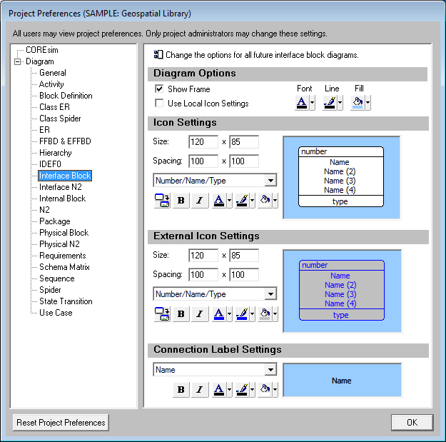
Diagram Options
Show Frame - controls whether a frame will be shown around the diagram. If a frame is shown, the frame block contents are specified by the General Diagram settings.
Use Local Icon Settings - determines whether each individual diagram defaults to use its own independent (local) icon settings or these global settings. If the diagram is marked to use local icon settings, changes to the icon settings in the Project Preferences will not impact that diagram. If the diagram is marked to use global icon settings, diagram icons will update as the user changes the icon settings in the Project Preferences. If you wish to standardize the look of your diagrams across each individual diagram, using global settings will simplify icon management. When a specific diagram has special needs, using local icon settings allows you to customize the diagram-level icon settings.
Color - controls the font, line, and fill color for the diagram background. On the interface block diagram, the line color controls the diagram frame.
| |
Tips and Tricks
When using graphical images on diagrams, it is often best to use a white background.
|
Icon Settings
The icon settings control the default display of the child component icons on the diagram. The graphic pane displays a sample icon based upon the current icon settings. This is useful in evaluating how much space is available to display information on the icon. On a given diagram, individual icons can then be customized, as desired.
Icon Size - controls the default width and height of icons on the diagram. The width and height must each be between 10 and 500 pixels, inclusive.
Icon Spacing - controls the default spacing between icons used by the diagram positioning algorithm. The horizontal and vertical spacing must each be between 5 and 500 pixels, inclusive.
Icon Template - this drop-down allows you to select the desired icon content from the collection of templates defined at the project level. You can display any combination of element information and labels on the icon. Icon templates can be created or customized via the Icon Registry under the Utilities section of the project explorer.
Use Image - toggles the default icon presentation between a geometric frame and a graphic representation. If toggled to display a graphic, CORE will display the image associated with the element with the icon template fields shown below the image. If the element bitmap has not been set, CORE will display the image associated with the element's class.
Bold - toggles bold font on or off for the icon text.
Italic - toggles italics font on or off for the icon text.
Color - provides access to the standard color palette to set the default font, line, and fill color used when drawing icons on this diagram. The order of precedence CORE uses when drawing a specific node on a diagram is as follows. If a color setting is nil/automatic, CORE will continue to move down the list until it identifies the color to be used:
-
Colors applied directly to the specific node on the specific diagram (set using the toolbar buttons on the diagram)
-
Colors specified for the element font, line, and fill attribute fields (set on the secondary tab of the element property sheet)
-
Colors specified for the element class font, line, and fill properties (set on the class property sheet)
-
Colors specified for the node construct type (set in the General Diagram category of the project preferences)
-
Node colors specified for the diagram type (set in the Diagram Options)
External Icon Settings
The external icon settings control the default display of the external components that interface with icons on this diagram but are not part of the composition of the main component. Individual icons can then be customized, as desired. The options available are identical to the icon settings options.
| |
Tips and Tricks
By default, external icons are shown with a gray background and dark blue line and text. Maintaining a different color scheme for the external components is very helpful in avoiding confusion regarding composition on interface block diagrams.
|
Connection Label Settings
These settings control the representation of the interfaces joining components and their corresponding labels. By default, these elements are represented by their name. However, any representation can be used for connections as it can for the component icons by selecting the desired template from the drop-down list of icon templates. For example, you can display abbreviations only to de-clutter the diagram, display numbers and names to show more information, or present any combination of element information and labels you desire. The content of the icon template is automatically concatenated into a single label for display.
With the exception of the Use Image option which is not appropriate for arrows, the connection label settings available are identical to the icon settings options.