The activity diagram preferences allow you to determine how activity diagrams are displayed by default (options controlling what is displayed and how). Individual activity diagrams can then be customized, as desired.
Options set in the Project Preferences dialog establish the defaults for all future diagrams. Any diagrams which are open or diagrams for which the view settings have been saved will not be affected by changes to the project preferences. To change these diagrams, open the individual diagram and change the local options.
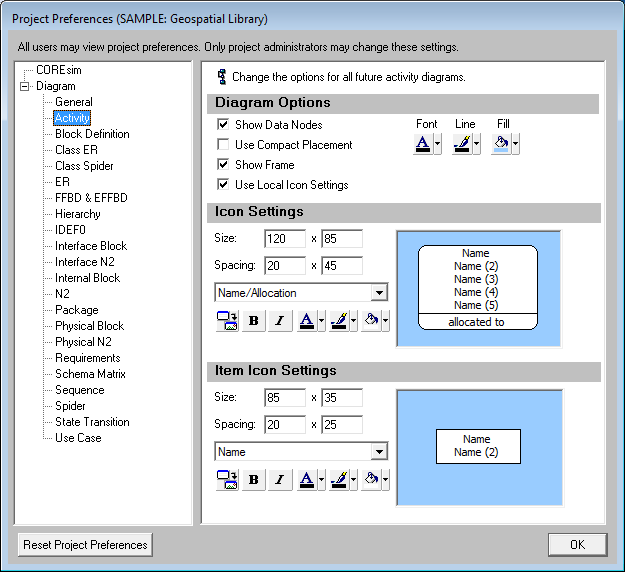
Show Data Nodes - controls whether data stores will be shown by default. In cases where there is a large amount of data flow, it can be helpful to hide data stores to focus attention on triggering data.
Use Compact Placement - controls the default spacing between branches on the diagram. If compact placement is enabled, no additional space is reserved for item nodes. For diagrams with a large number of data nodes, disabling compact placement will simplify diagram layout.
Show Frame - controls whether a frame will be shown around the diagram. If a frame is shown, the frame block contents are specified by the General Diagram settings.
Use Local Icon Settings - determines whether each individual diagram defaults to use its own independent (local) icon settings or these global settings. If the diagram is marked to use local icon settings, changes to the icon settings in the Project Preferences will not impact that diagram. If the diagram is marked to use global icon settings, diagram icons will update as the user changes the icon settings in the Project Preferences. If you wish to standardize the look of your diagrams across each individual diagram, using global settings will simplify icon management. When a specific diagram has special needs, using local icon settings allows you to customize the diagram-level icon settings.
Color - This setting controls the font, line, and fill color for the diagram background. On the activity diagram, the line color controls the lines connecting functions to items as well as the diagram frame.
 |
Tips and Tricks When using graphical images on diagrams, it is often best to use a white background. |
The icon settings control the default display of the activity icons on the diagram. The graphic pane displays a sample icon based upon the current icon settings. This is useful in evaluating how much space is available to display information on the icon. On a given diagram, individual icons can then be customized, as desired.
Icon Size - controls the default width and height of icons on the diagram. The width and height must each be between 10 and 500 pixels, inclusive.
Icon Spacing - controls the default spacing between icons used by the diagram positioning algorithm. The horizontal and vertical spacing must each be between 5 and 500 pixels, inclusive.
Icon Template - this drop-down allows you to select the desired icon content from the collection of templates defined at the project level. You can display any combination of element information and labels on the icon. Icon templates can be created or customized via the Icon Registry under the Utilities section of the project explorer.
Use Image - toggles the default icon presentation between a geometric frame and a graphic representation. If toggled to display a graphic, CORE will display the image associated with the element with the icon template fields shown below the image. If the element bitmap has not been set, CORE will display the image associated with the element's class.
Bold - toggles bold font on or off for the icon text.
Italic - toggles italics font on or off for the icon text.
Color - provides access to the standard color palette to set the default font, line, and fill color used when drawing icons on this diagram. The order of precedence CORE uses when drawing a specific node on a diagram is as follows. If a color setting is nil/automatic, CORE will continue to move down the list until it identifies the color to be used:
Colors applied directly to the specific node on the specific diagram (set using the toolbar buttons on the diagram)
Colors specified for the element font, line, and fill attribute fields (set on the secondary tab of the element property sheet)
Colors specified for the element class font, line, and fill properties (set on the class property sheet)
Colors specified for the node construct type (set in the General Diagram category of the project preferences)
Node colors specified for the diagram type (set in the Diagram Options)
The item icon settings control the default display of the data and trigger icons on the diagram. Individual items can then be customized, as desired. The options available are identical to the icon settings options.